Picking the right paint color can feel like a big decision, and for good reason. The tones you choose set the mood of a room, influence how large or small a space feels, and even affect how you interact with it day to day. Color isn’t just about style — it’s about function and perception. The process becomes much more manageable when you understand the basics of color theory and how light interacts with different shades.
In upscale homes in San Diego, designers often use the science of color to highlight open layouts, maximize natural light, and create seamless transitions between rooms. You don’t need to be a professional to apply the same principles. With a thoughtful approach, you can feel confident choosing paint tones that enhance every space in your home.
Understanding Color Theory Basics
Color theory is the foundation for making informed decisions about paint tones. Primary, secondary, and tertiary colors interact predictably, influencing perception. Complementary colors sit opposite each other on the color wheel and create contrast, while analogous colors sit side by side and establish harmony. These relationships guide how walls, trim, and accents can be combined effectively.
When choosing paint tones, consider the impact of hue, saturation, and brightness. For example, muted shades with lower saturation are easier on the eyes and suitable for large spaces, while brighter colors work best in smaller doses. Designers often use these principles in upscale San Diego homes to ensure rooms feel cohesive across open floor plans.
The Role of Natural and Artificial Light
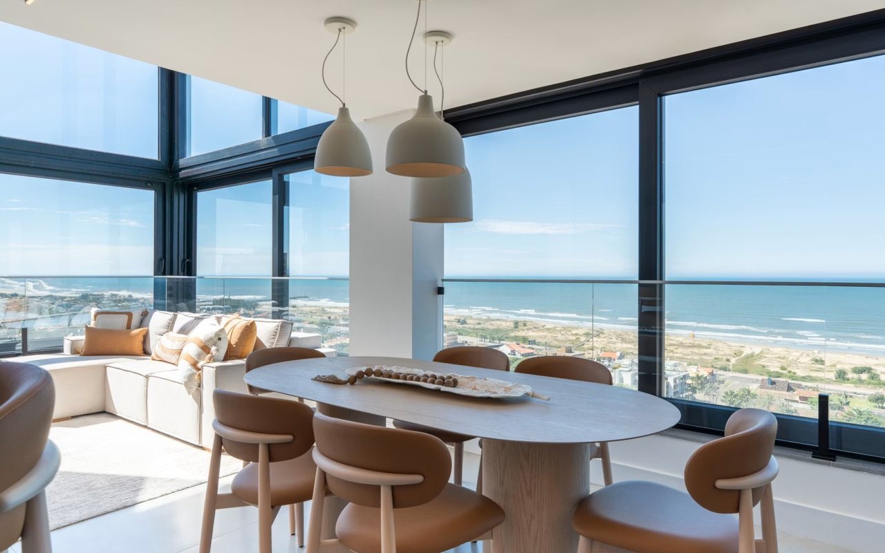
Light changes color perception, making it a critical factor in paint selection. North-facing rooms tend to emphasize cooler undertones, while south-facing spaces highlight warmth. East- and west-facing rooms shift appearance throughout the day, requiring careful testing of samples before finalizing a decision.
Artificial lighting also plays a role. LED, incandescent, and halogen bulbs all cast different color temperatures. When choosing paint tones, it is best to view samples under the same lighting conditions the room will typically have. In San Diego’s luxury properties, where natural light is abundant, balancing sunlight with indoor fixtures helps achieve consistency.
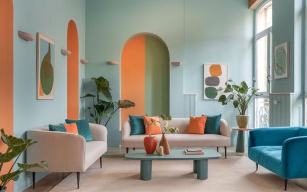
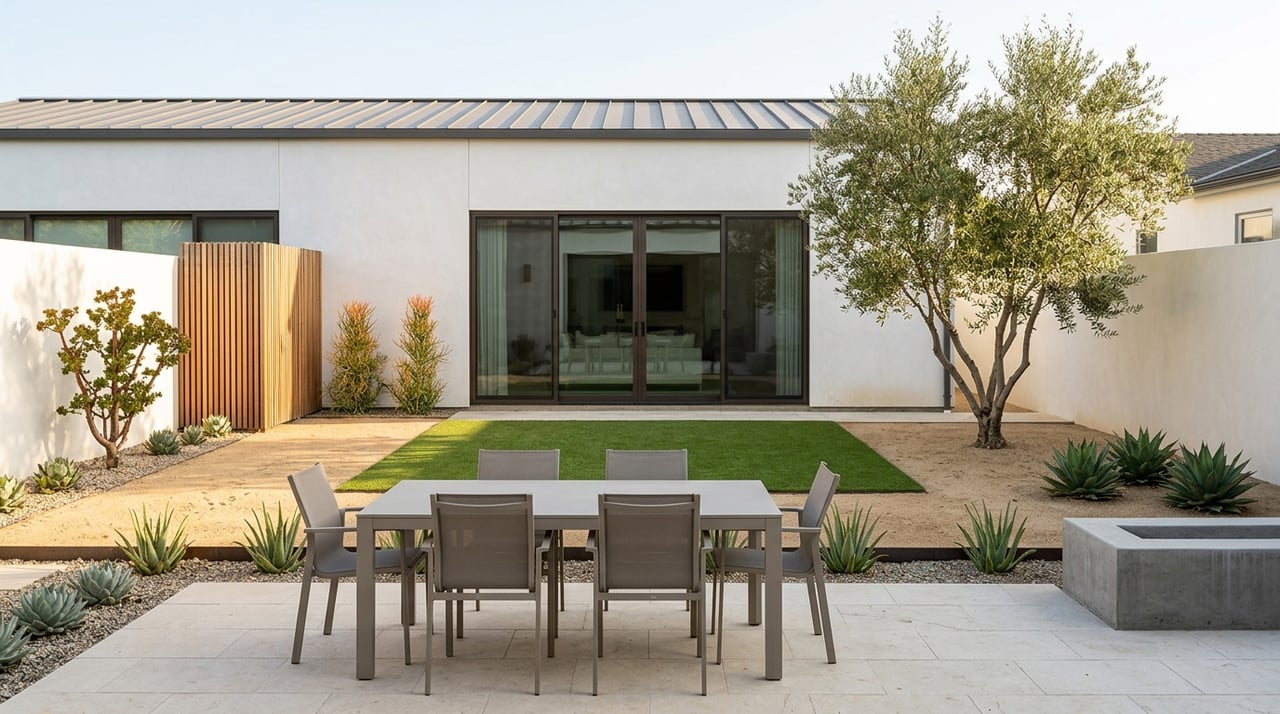
Warm Tones for Social Spaces
Colors such as terracotta, golden beige, and soft coral fall into the warm spectrum. These tones encourage interaction and create an inviting environment. They are particularly effective in living rooms, dining rooms, and kitchens where gatherings are frequent.
In larger San Diego residences, warm tones can be paired with natural materials such as stone and wood to add depth. Choosing paint tones in this range should focus on shades that complement surrounding finishes. Avoid overly bold versions, as subtlety often produces a more refined result.
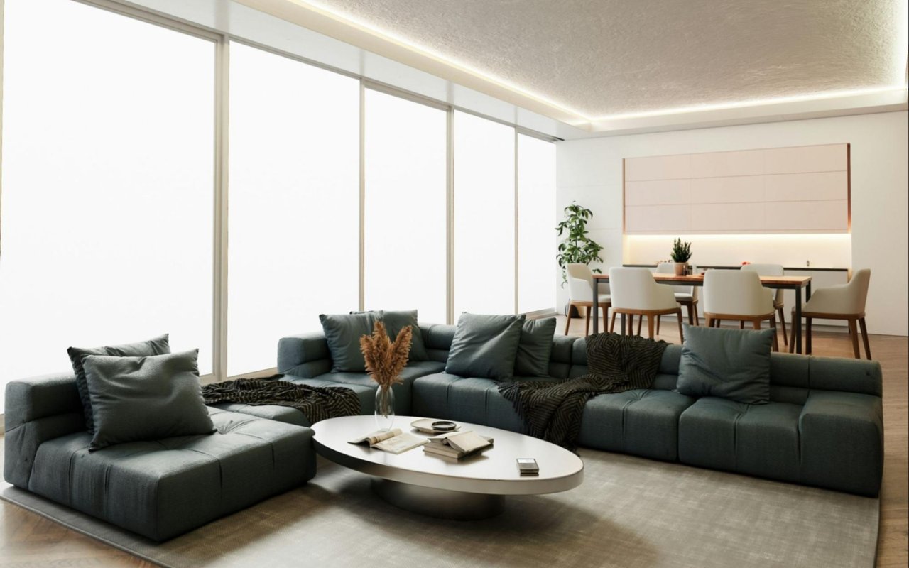
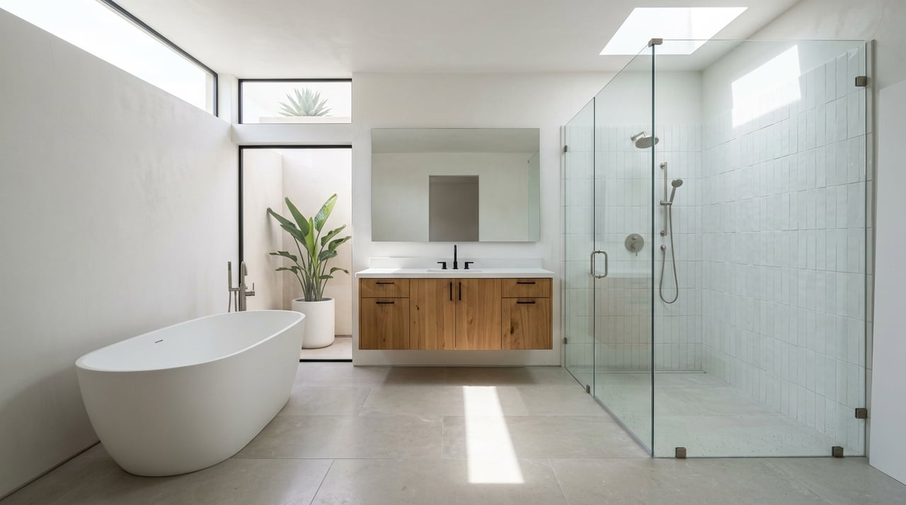
Cool Tones for Restful Environments
Cool shades like pale blue, sage green, and misty gray promote calmness and clarity. These tones are typically well-suited for bedrooms, bathrooms, and home offices where relaxation or focus is a priority. The cooler spectrum reflects more light, which can help rooms feel open and refreshing.
Cool tones often mirror the natural environment in upscale coastal homes in San Diego. Soft ocean-inspired hues bring continuity between interior and exterior spaces. When choosing paint tones in this family, select lighter variations for small rooms and mid-range shades for larger, more open areas.
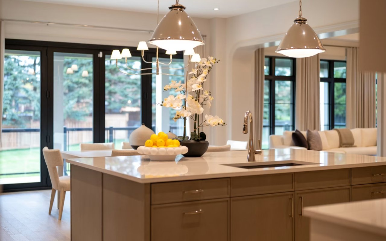
Neutral Palettes for Versatility
Neutral colors remain a design cornerstone because they adapt easily to different furnishings and styles. Shades like ivory, taupe, and charcoal provide balance without overwhelming the senses. These colors also act as a backdrop for accent walls, artwork, and textured décor.
Upscale homes in San Diego often rely on neutrals for open-concept layouts. Choosing paint tones in a neutral spectrum creates flow from one space to another. Layering light and dark neutrals also introduces subtle contrast, avoiding a flat or monotonous appearance.
Accent Walls and Feature Colors
Accent walls are a strategic way to introduce bold or distinctive hues without overwhelming an entire room. Deep navy, charcoal, or even jewel tones can define a focal point and add interest. Limiting strong colors to a single wall or architectural feature helps maintain balance in the overall design.
For example, a darker accent wall can anchor the space in a San Diego property with high ceilings. Choosing paint tones for accent areas requires consideration of both adjacent walls and furniture. Test samples on-site to confirm the chosen color enhances rather than distracts from the room’s layout.
Coordination Across Multiple Rooms
Consistency is key in larger homes with open transitions between rooms. While each space can have its own identity, shared undertones and related hues create a sense of flow. This approach is critical in upscale San Diego homes, which often feature open layouts.
When choosing paint tones, use a palette with three to five complementary colors. Assign lighter shades to high-traffic areas, mid-tones to private rooms, and accent shades sparingly. This coordination allows each room to stand out while maintaining visual unity throughout the property.
Testing and Sampling Before Commitment
Paint samples can look very different in a store compared to the walls of a home. Applying swatches directly onto walls and observing them at other times of day is essential. Test in multiple spots, especially near windows, doorways, and artificial light sources.
Many homeowners underestimate how undertones shift in real conditions. For instance, a gray paint with green undertones may appear blue in certain lighting. In San Diego, where bright natural light is prevalent, thorough testing is crucial for choosing consistent paint tones.
Finishes and Their Influence
The finish of a paint affects how a color is perceived. Flat or matte finishes minimize reflection and are suitable for ceilings and low-traffic areas. Eggshell and satin finishes add a slight sheen, making them ideal for living rooms and hallways. Gloss finishes emphasize details and highlight imperfections, so they are best reserved for trim and cabinetry.
In modern San Diego interiors, designers often combine finishes for effect. A matte wall paired with semi-gloss trim provides contrast and definition. Choosing paint tones should always consider the finish to ensure the final result meets both aesthetic and practical goals.
Work with Kara Kay for Your San Diego Real Estate Goals
Color choices can transform how a home feels, but the bigger picture is how your property fits into the market. The right design decisions enhance your living experience and add measurable value when it’s time to sell. A real estate professional who understands design and market dynamics ensures you get the best results.
Kara Kay has the expertise to guide you through San Diego’s competitive real estate market. Kara knows which features buyers notice, how to present a property effectively, and what strategies lead to successful outcomes. If you’re ready to buy, sell, or simply explore your options,
reach out to Kara Kay to align your real estate goals with expert guidance and local insight.